The project stands on an idea: if the brand doesn't reflect your way of thinking, why would anyone trust you with their budget? The visual language takes an editorial direction — forest green, typography from a Czech type foundry, halftone textures.
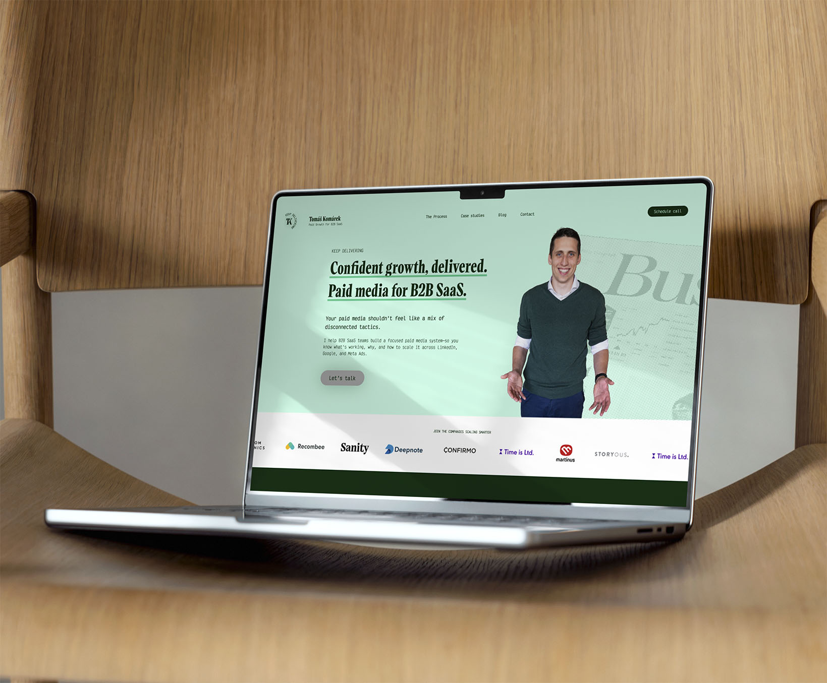
In the client’s own words: As a B2B SaaS freelancer, this new identity gave me confidence and a strong asset. Client conversations became faster and easier — and that's a very tangible result.
Get in touch and let's create something great.
Have a project in mind?